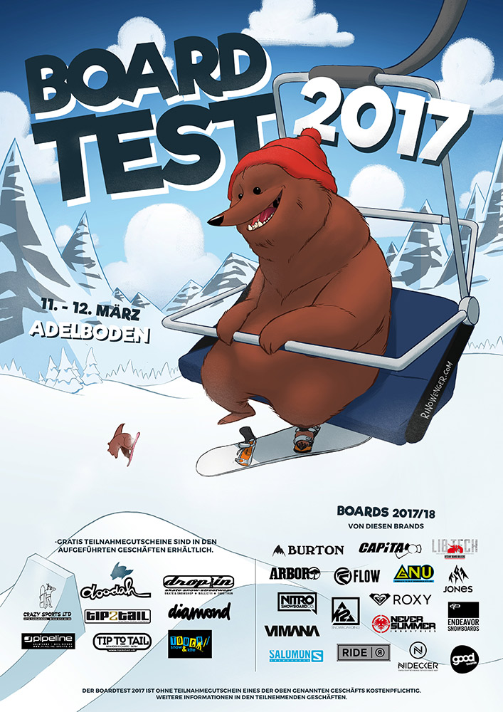
The composition is built this way so there is some room for the big event typo at the top, some room for the date next to the bear and a lot of whitespace for the logos and text at the bottom. I tried to balance the different elements on the poster so the information is conveyed without getting overbearing (haha).