Sketchblog

Fantasy Basel Review

18.05.2017       2

At the beginning of the month was the Fantasy Basel, where for the first time I had my own artist table at a convention. The Fantasy Basel is the swiss version of the Comic Cons happening all over the world. This means, there’s a lot of comic Fans, gamers, Cosplayers and generally nerds of all kinds meeting in one place for a weekend. Next to boothes from big Companies from the Game industry, there were lots of booths dedicated to Cosplay and Costumes in general. You could even buy proper Bows or Swords. There was also a Steampunk Café, different Star Wars Sets recreated entirely with Lego and generally a ton of pretty impressive Costumes. And next to all of this there was, of course, the ‚Artist Alley‘, where Artists can set up a booth to exhibit their work during the convention.

After going full freelance beginning of this year, Fantasy Basel was a big goal to work towards. I did not know what to expect, especially since I heard they were expecting over 50’000 people over those thee days.

I invested in some prints, decoration for the booth and created new artwork to show and sell. Next to original art, I had prints in A5 and A4, Postcards and a Poster for sale. Every day we had a small giveaway for all the people who registered themselves for my new newsletter. I also designed a big rollup, which is 100 by 200 cm, (or roughly 40 by 80 inch, if you’re more into the imperial system). It was pretty exciting to finally see it live. The rollup was printed by printzessin.ch, which I really recommend.

I had two friends, Räffu and Simu, helping me out at the booth. This was not only helpful in busier times of the day, but also a lot more fun. In general I met a lot of interesting people at Fantasy Basel, and to me that’s really what conventions like these are about: Connecting with people and getting inspired by them. It was a great experience and I can only recommend to go and get a booth yourself, it’s a great opportunity to get your art in front of a lot of eyeballs and grow as an artist.

A fresh start

26.04.2017       0

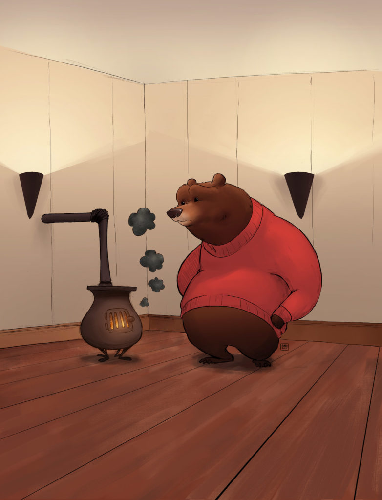
Finally the new version of this website is online. As car mechanics mostly have pretty rundown cars, a lot of people working in the digital industry have a crappy website. You spend so much working on digital products through regular jobs that you don’t want to take care of another one in your spare time. But every once in a while the planets align and you get to update your website.

About & Services


A lot of thought also went behind the Services and About section. What do I want my Business to be about? Through the last decade (just writing down the word decade made me feel rather old) I went through the transition from being a Programmer to a (self-taught) Designer in different disciplines and Companies until finally starting my own Company. Determining my professional identity exactly was no simple task, which is why I spent a lot of thinking about how to best describe my services.

I used to go with the tagline «Illustration & Graphic Design». My issue with this was, that the Graphic Design part suggests a focus in the traditional Graphic Design business. That industry went through quite some changes since the Web replaced a lot of traditional media. Clients need less traditional print communication than they used to, while a whole new industry formed around design for digital products, where Disciplines include Interaction Design and User Experience Design among a gazillion of other buzzwords. As a result, Graphic Designers who didn’t learn the skills for digital design have a hard time.

Do emphasize more on the digital side, I changed the tagline to «Illustration & Visual Design». Visual Design represent both the visual aspect of digital products as well as Graphic Design in traditional media.

Research

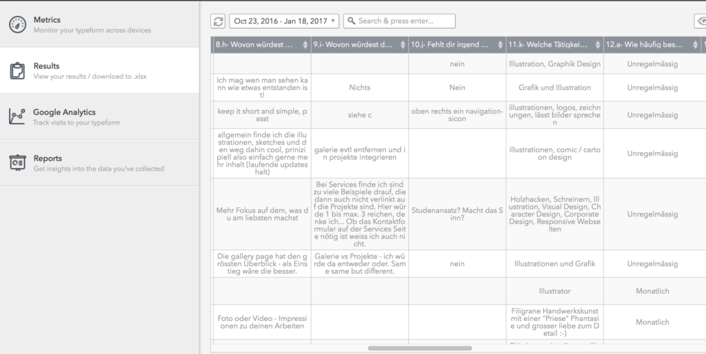
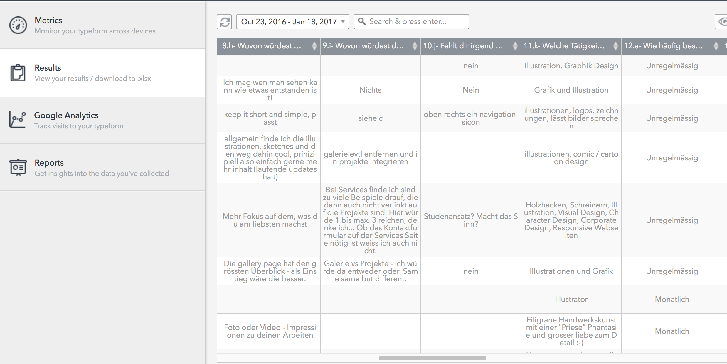
A big help was the little survey I did a while back. The feedback helped me a ton in determining what to prioritize and how to structure the content. For example, I learned that people cared way more about the story behind a project and how it was done than I would have gessed.
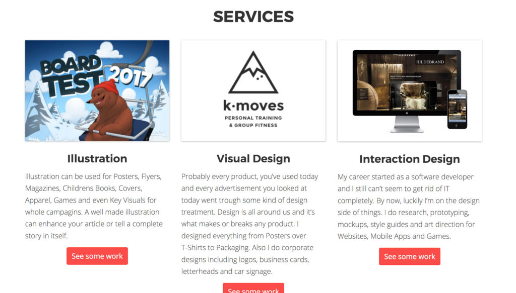
Work

As with everyone who works in a creative industry, the portfolio is the most important thing for a new client or employer to determine what you’re able to do. Also it’s always a ton of work not only selecting which pieces to include, (and more importantly, which pieces to not include) but also presenting in the best way possible.

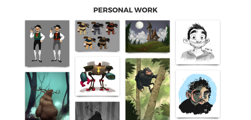
The work is split into Projects and Personal Work. This separation helps a lot in that I can just upload personal drawings and sketches in a simple manner without mixing them up with commercial work I did.

Technicalities

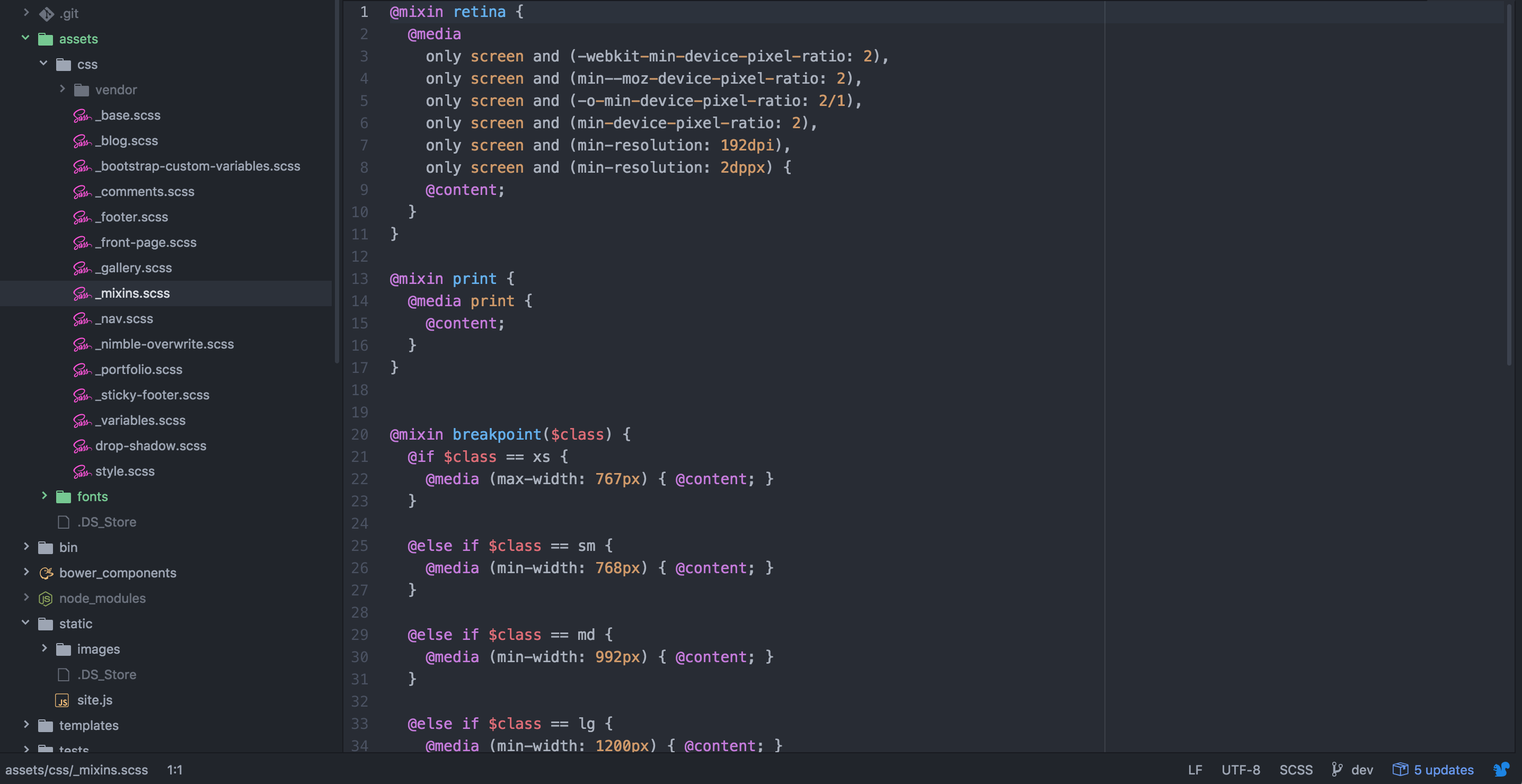
This website runs wordpress, as does over 25 % of the entire web. For anybody who cares about the technical details, I designed my own theme using Timber, which is a Plugin to use the Templating-Language Twig in WordPress-Themes. In more simpler terms, it’s just a way to write your WordPress-Theme a lot clearer and reduce the amount of headaches doing it significantly. You still need to write HTML and CSS yourself but you can do so with very little knowledge about WordPress or even PHP.

I used the Timber Starter Theme as a base, which is a very good starting point for Timber. A gulp setup including browsersync sped up things like finetuning the Theme a lot. I even managed to get Webfonts for Open Sans and FontAwesome as npm-packages and get it to compile into the target directory, which sounds easy but was ridiculously difficult at first. Bootstrap was a great boilerplate for standard design elements and the responsive menu, and using the SASS-version with custom variables made sure I could keep messy overwrites to a minimum.

And of course using git with a (free) BitBucket Account made sure I could not only revert back after messing up something but also that pushing changes to the live Site (the one you are reading right now) way easier.

As with all the things that you build yourself instead of picking from the shelve, I learned a ton and even had a little bit of fun.
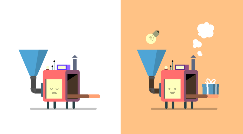
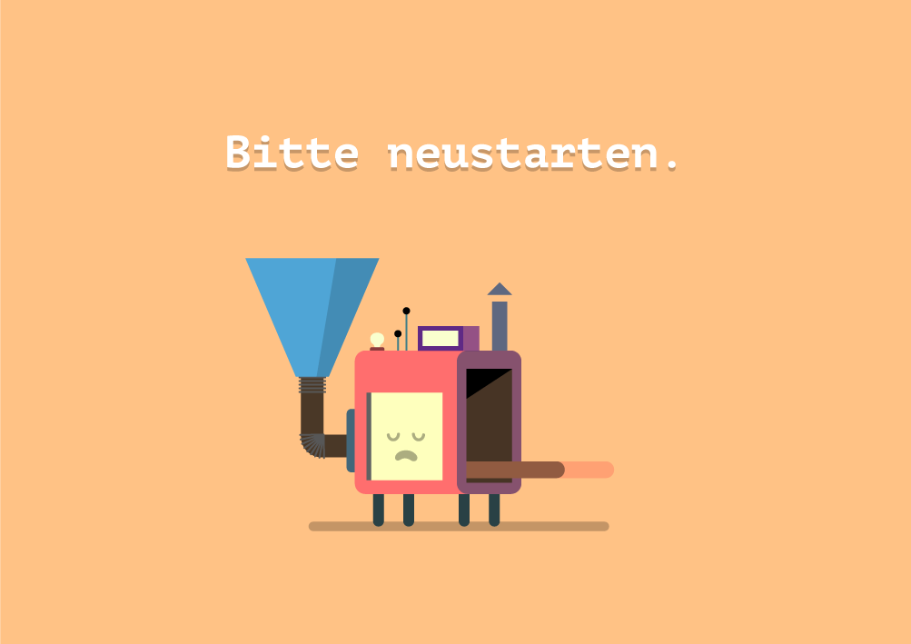
Feedback

Since this is just another iteration of a product, I need to get feedback in order to improve it. What do you think of the new website? Is it better than the old one? Is something missing? Let me know in the comments.

Boardtest 17

01.03.2017       0

In two weeks there’s the Boardtest in Adelboden, Switzerland, where you get to test next seasons Snowboards from a ton of different brands. This year I was asked to illustrate the visual for the event communication again.

Of course we kept the bear from last year’s illustration. This time he’s sitting in the chairlift, while his buddy is doing a Backside 720° over the jump below.

The composition is built this way so there is some room for the big event typo at the top, some room for the date next to the bear and a lot of whitespace for the logos and text at the bottom. I tried to balance the different elements on the poster so the information is conveyed without getting overbearing (haha).

The five lucky winners

06.02.2017       1

You guys are the best. I got a ton of very helpful feedback from my survey. The survey was conducted in two languages in a typeform.

I chose out 5 lucky winners for the prints. The prints should be on their way or already arrived. Or in Ania’s case, on the way to Portugal a second time because I apparently wrote the address wrong on the first try 😀

The five lucky winners are:

– Ania Marcos, Portugal
– Britny Arnett, USA
– Sascha Scheidegger, Thun, Switzerland
– Christoph Höschele, Bern, Switzerland
– Soleil Zumbrunn, Zürich, Switzerland

Thank you everybody for participating!

Dr. T

13.01.2017       0

Finally found some time to try out the amazing Photoshop Brushes of Kyle T. Webster. If you don’t have them yet, get them. I have the megapack and it’s totally worth it’s price.

Oats Portrait

03.01.2017       0

rinowenger_chrisoatley_portrait

A quick portrait of my friend and mentor, Chris Oatley. Probably the mellowest guy in animation and a man with a heart made of gold.

Chris is the host of my favorite podcast, the Artcast, and also the mastermind behind the Oatley Academy, an online art school where you can get your Painting and also Storytelling skills on to the next level.

Help me redesign this website

08.11.2016       1

rinowenger_survey_win-print

This site annoys me. There are a couple of things that bother me and that could be improved. As probably any Designer in any point in time, I want to tear down my website and redesign it from the ground up. I did this a couple of times already and would have a couple of places to start from.

But this time it isn’t about me, it’s about you. Designers tend to be narcisstic by nature, but this website doesn’t exist only for me to look at my own stuff on the web. It’s purpose is to reach people out there and resonate. The most carefully crafted message is wasted if it doesn’t reach it’s recipient.

I need to know what currently works and what doesn’t, and instead of guessing that for myself, I need to hear that from you. To gather your feedback, I created a little typeform. It takes only 5 minutes to answer.

„What do I get out of this?“, you might ask yourself. Well, first of all, you get the warm, fuzzy feeling of helping out a really cool dude. And if that alone wasn’t enough, you also get the chance of winning one of 5 prints of mine. The survey is available in german or english.

Take the survey in german

Take the survey in english

Designing the Giant

31.10.2016       2

Currently I’m taking a course called „The Spark“ at the Oatley Academy. It’s an online course with about 15 students and our amazing Teacher Sarah Marino. The course is challenging, but we learn a ton and it’s a lot of fun.

As a course project we’re doing Visual Development for a story. That means we’re designing the characters, designing layouts (rough sketches of a certain scene), props (pretty much all the stuff characters interact with, lamps, weapons, furniture, etc.) and more.

rinowenger_silhouettes_giant

rinowenger_riese_skizze

One of the characters I’m designing is the Giant. He is, well, giant, not the brightest star under the sun and also not a very pleasant guy to hang around.

riese_silhouette_rework rinowenger_riese_outlines_rework rinowenger_riese_farben_2016-10-02 riese_final_color

While going through the color variations I found that it would be cool if he had white eyes, just to make him even a little less human and even more frightning.

What do you think? How does the final design feel to you? Let me know in the comments.